Easter eggs arrive on shelves every year, but behind each one is months of creativity, testing and design judging with shoppers expecting more choice and more personality.
Teams across confectionery work to make something that feels special the moment you spot it, and even more so when you crack it open.
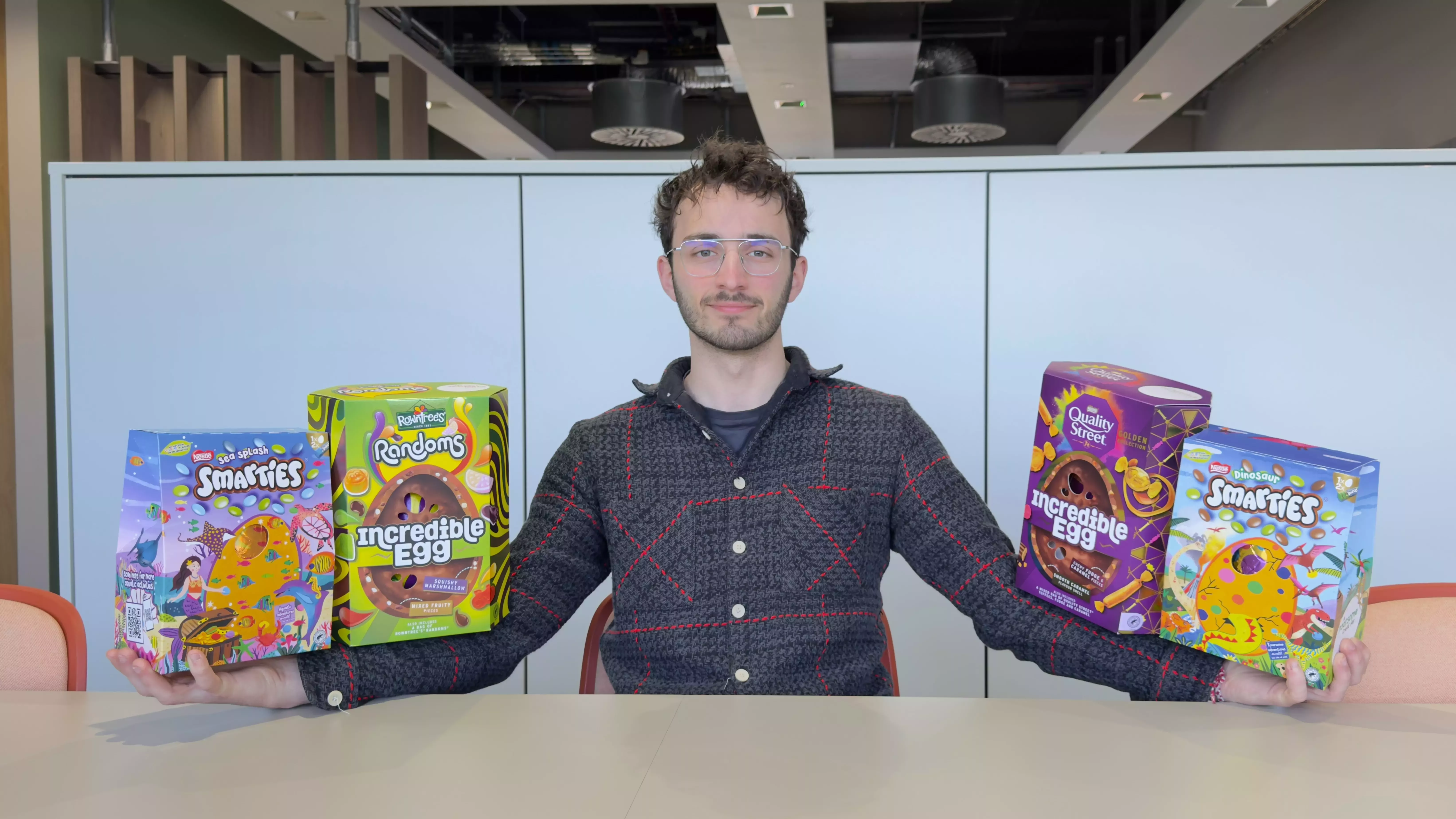
We caught up with Torin Zieboll, Seasonal Brand Manager for Nestlé Confectionery UK and Ireland, to explore four key elements: the egg itself, the packaging, artwork and the most important element of all: ‘the moment’.
The egg
For Torin, everything starts with choice.
“We want to offer different price points for people with different budgets. You’re buying for different friends, different family members, and perhaps different Easter occasions – it isn’t a one size fits all.”
Egg development follows two distinct paths. One focuses on longer term ranges, ensuring the right mix of sizes and price points as shopping habits change. As shoppers move up the range, expectations rise too. The other path is about limited-run ‘buzz-maker’ eggs – familiar brands with a flavour or texture twist.
“Some shoppers love a trusted brand but with something unexpected to spice things up. Those products rotate every year to keep things fresh. This year, that’s come to life through inclusions in the shell and marbled two-tone finishes that act as visual cues for flavour. Sadly, I think I’ve missed the Pistachio train, and it may have left the station by next Easter, but I have really cool friends so hopefully they’ll let me know what the next trend is.”
The packaging
The box is the first impression.
“Our engineers are always telling me the box should be rectangle for speed and efficiency. Despite that, we’re always trying to see how we can make the box feel a bit more special. It could be little bevels on the side, cut outs so you can see the egg foil inside or adding finishing effects like varnishing.
“As well as size, I’m thinking how unique it looks on shelf. We have more unique shapes on our Giant and Incredible eggs in this year’s range, but for Easter 2027 we have a box shape unlike anything seen before… I would tell you, but then I would have to kill you.”
There’s a balance to strike on shelf. Using similar carton structures can help ranges block together visually. Torin and the seasonal team have designed the artwork to compliment all of our confectionery brands simultaneously, for example on our large eggs the patterns connect across.
“We also spend time looking at the unboxing experience, from how the eggs fit inside the box to how easy they are to pull out the box. I spent some time the other week comparing glue strengths across different brands in the market to work out which were the easiest to open. Indeed, I am truly fun at parties.”
The artwork
“While I may have got a C in GCSE art, I still know what goes into good artwork design.”
Artwork prompts shoppers to make decisions in seconds. What are they picking up? Flavour, texture, indulgence level and price tier.
“For indulgent eggs, you’ll see richer patterns and densely packed visuals, which helps the brain associate the product with a more luxurious experience. Lighter-positioned brands use more open space to reinforce an easier, everyday treat. Higher-tier eggs also use aesthetic patterns to suggest the texture you’ll experience when you bite into them. And of course, close-up chocolate images play a major role in appetite appeal.
“Certain colours can give certain connotations, but the actual brand colour pallet will always be more important. Any space not involving brand colours tends to prioritise communicating flavour. Orange for orange, green for hazelnut, blue for the depths of the ocean. We have that flavour coming out next year (joke).”
Words on pack also work as design elements. Short, simple words help shoppers decode what they’re buying in seconds. Designers also need to work around the practical elements, legal information, weight and claims, ensuring compliance without losing visual impact.
The moment
From texture to typography, every decision across egg, packaging and artwork is designed around that single special moment, when it’s handed over from gifter to giftee.
“Any gift can be seen as a show of appreciation for someone else. I want my eggs to seem more appreciative than any other eggs on the market. The Easter moment for me personally though is walking down the filled aisles and taking a picture to send to my parents. Sometimes they say that they’re proud of me. I’ve not found many other ways yet.”
